Overview & exceptions
An overall score summarizes the test, while warning icons highlight individual measurements that need attention.
03 / Information design · Leslie’s
A two-page customer report connecting water-test measurements, general maintenance guidance, and an issue-specific treatment plan.
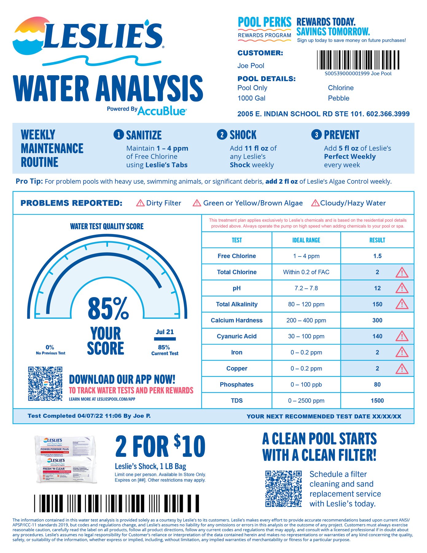
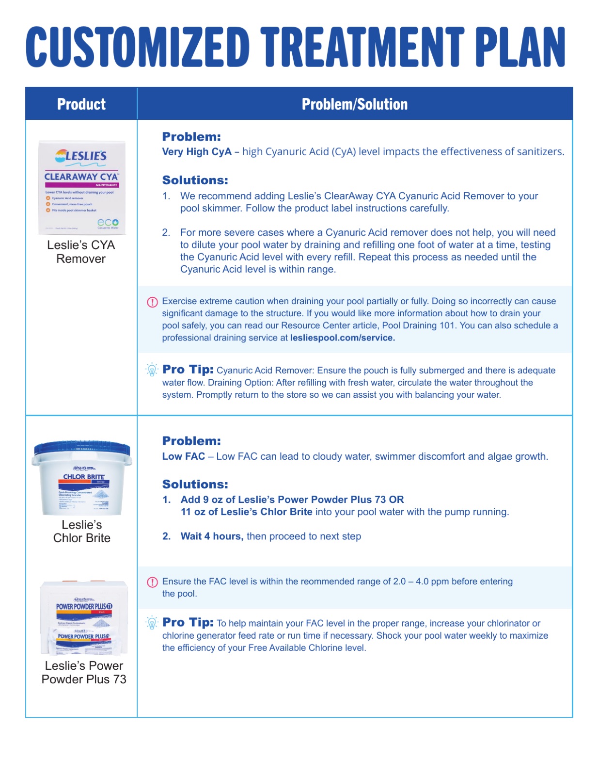
A water test produces measurements that can be difficult for a pool owner to interpret. I designed a two-page customer report that combines the test overview with a more detailed treatment plan.
My contribution: information hierarchy, layout, and the visual organization of measurements, warning flags, recommendations, and supporting brand messages.
The two pages serve different reading tasks: scanning the results and working through the recommendation.
An overall score summarizes the test, while warning icons highlight individual measurements that need attention.
Page 1 contains the general maintenance routine. Page 2 gives issue-specific explanations and recommended actions.
The report also includes app, rewards, and service messages. These compete for attention with test results and treatment guidance.
The score sits below the maintenance routine in the displayed layout. The next iteration would move the result summary higher and explain how the overall score relates to individual warning flags.
The report also needs a stronger separation between general maintenance, personalized treatment, and promotional content. These are proposed improvements to the current design, not changes already implemented.
I brought the test overview and issue-specific treatment plan into a two-page report. The layout separates scanning measurements from working through recommendations.
The next iteration would move the result summary higher, distinguish routine advice from treatment and promotional messages, and test whether customers can identify the main issue and next action quickly.