02 / Email design & creative systems · Leslie’s
Lifecycle Email Design & Creative System
A reusable email system brought to life through campaign graphics, promotional storytelling, and customer messages—from welcome emails to service reminders and re-engagement.
- My contribution
- Email visual design, templates & production
- System
- Reusable modules, components & guidance
- Coverage
- Promotions, rewards, service & customer lifecycle
- Introduced
- 2023 · expanded through subsequent campaigns
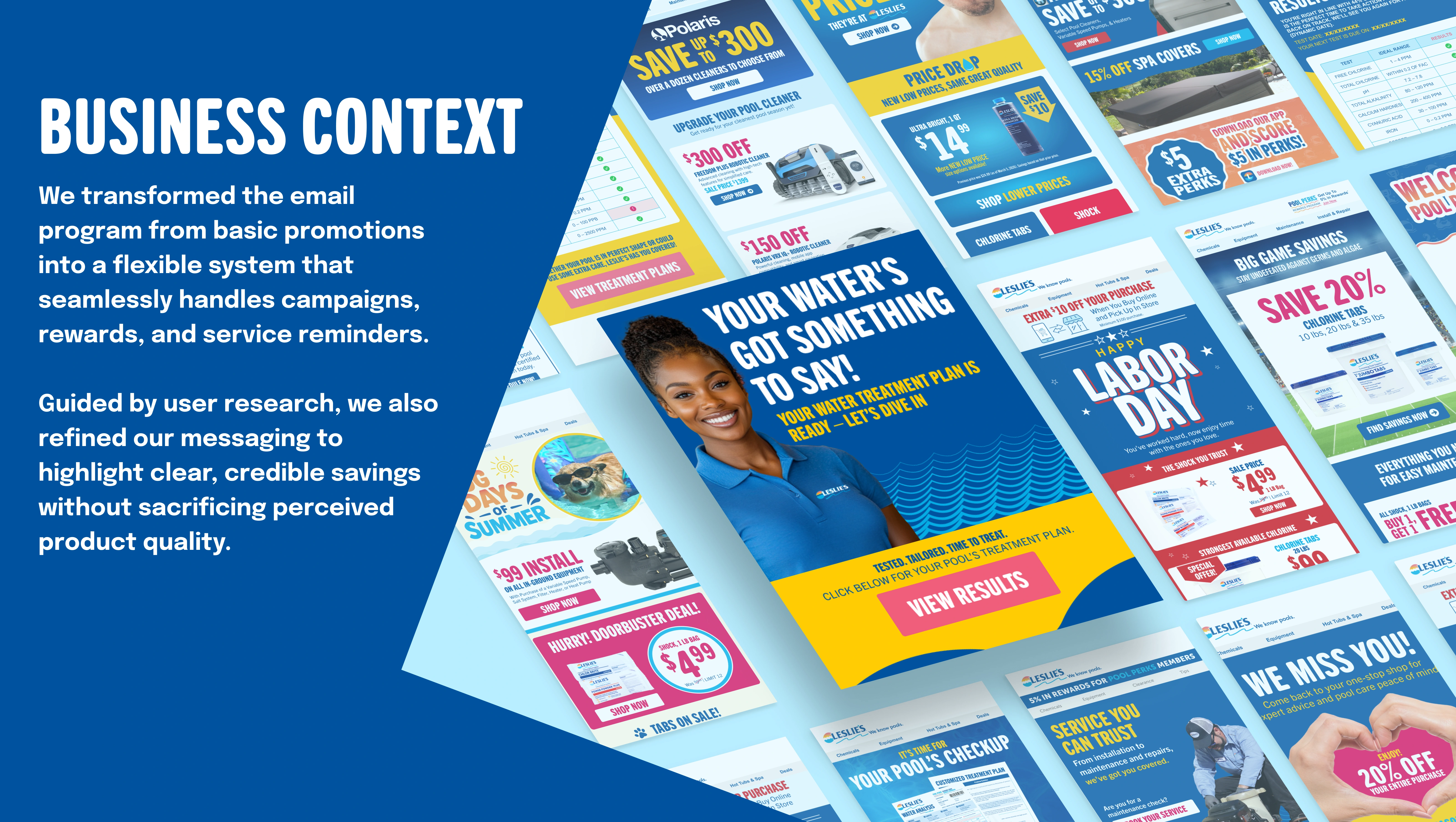
Move beyond one-off promotional emails.
Leslie’s email program needed to support more than sales announcements. Welcome messages, rewards, water-test results, service reminders, and re-engagement each required a different story while still feeling like the same brand.
My contribution combined system design with hands-on creative execution. I built reusable visual modules and templates, designed campaign graphics, shaped the hierarchy of offers and messages, and produced emails for different customer needs.
This case study focuses on the email experience and its visual building blocks. The broader team workflow and Figma adoption are covered in Building a Shared Figma Creative Workflow.
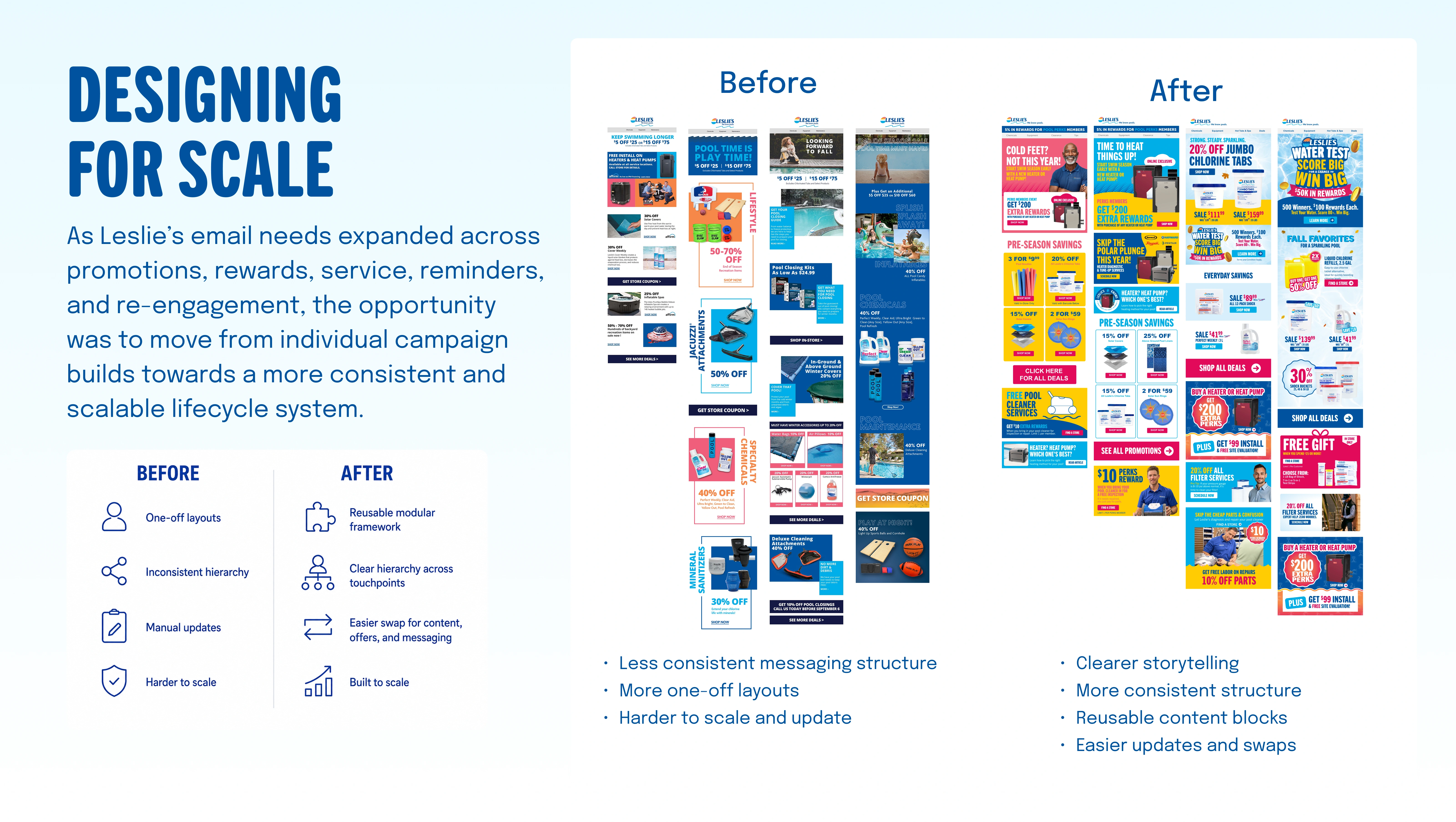
Create consistency without making every email the same.
The earlier examples relied on individual layouts with different approaches to hierarchy and content. As the program expanded, rebuilding each email made consistent updates harder.
I developed a repeatable structure that could accommodate different campaign identities and amounts of content. Branding, offer sections, calls to action, and supporting modules became reusable elements rather than isolated design decisions.
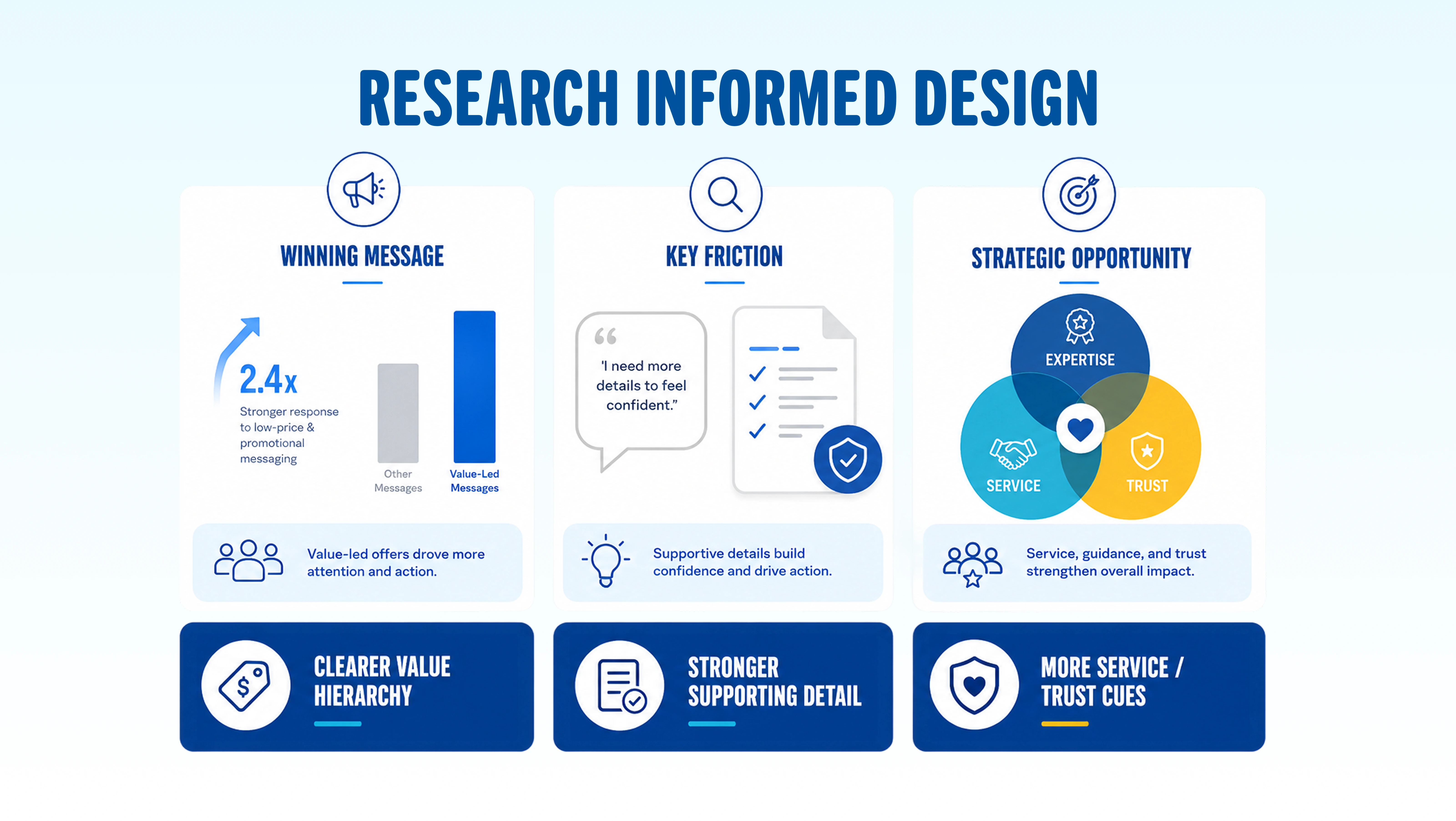
Lead with value. Support it with confidence.
The research summary highlighted two needs: clear savings attracted attention, and customers wanted enough supporting detail to feel confident. Service, expertise, and trust were also important parts of the message.
I translated those findings into visual priorities: make the offer easy to scan, give product and service details a clear supporting role, and use brand and expertise cues to reinforce credibility. Value-led messaging needed to communicate savings without implying lower product quality.
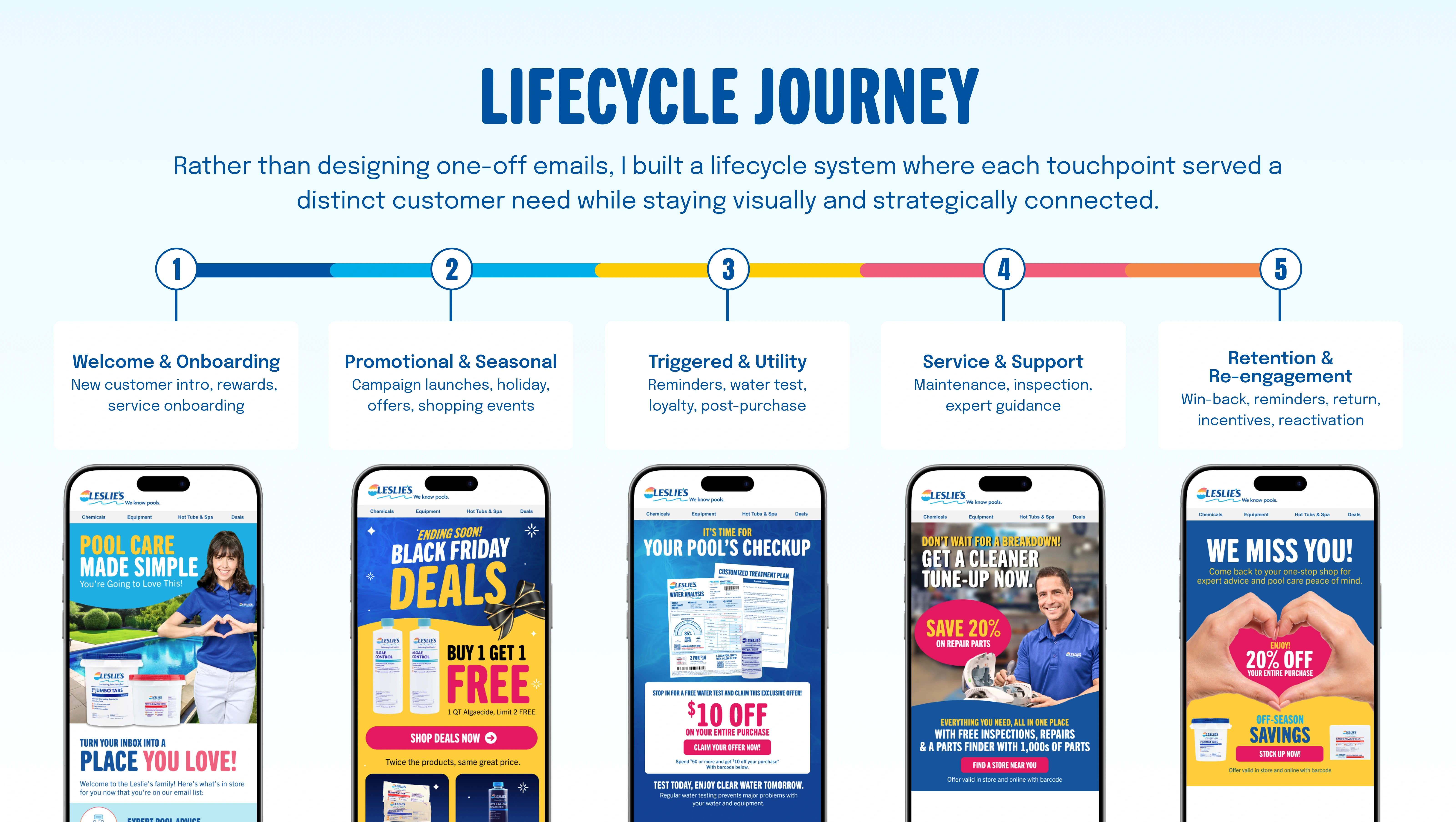
Give each customer moment a clear purpose.
I organized the visual system around five types of communication: welcome and onboarding, promotional and seasonal campaigns, triggered and utility messages, service and support, and retention and re-engagement.
The priority changes with the moment. A promotion leads with an offer; a water-test message directs customers to results; a service reminder explains a maintenance need; a re-engagement email gives customers a reason to return. Shared branding connects these messages without forcing them into one composition.
Build the recurring structure. Customize the story.
I designed reusable headers, navigation, calls to action, banners, icons, badges, and content blocks. The email structure moves from the main campaign message into supporting offers and content, followed by navigation and footer information.
The modules give the team a starting point for recurring needs while leaving room to change imagery, offer emphasis, and campaign graphics. This makes the system useful for production without flattening every campaign into the same design.
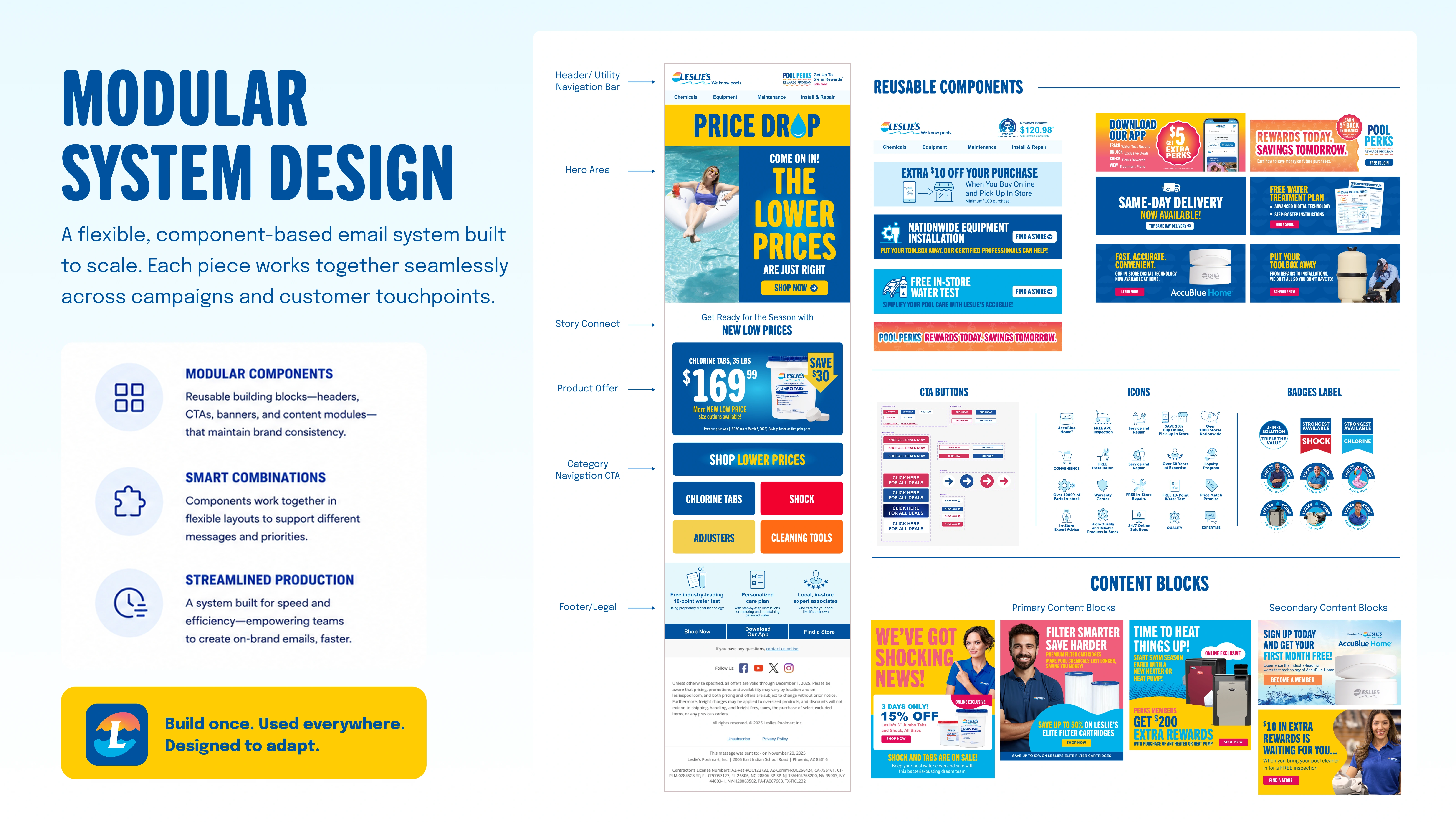
Use the system to create a wide range of emails.
I also designed the creative that fills the system: campaign imagery, promotional graphics, product offers, service messages, and visual storytelling. The gallery shows how these elements work across seasonal campaigns, loyalty, education, triggered messages, and customer retention.
Bold typography and color establish the main message, while supporting sections add product details, rewards, and service information. Repeated components keep navigation and actions familiar even when the campaign look changes.
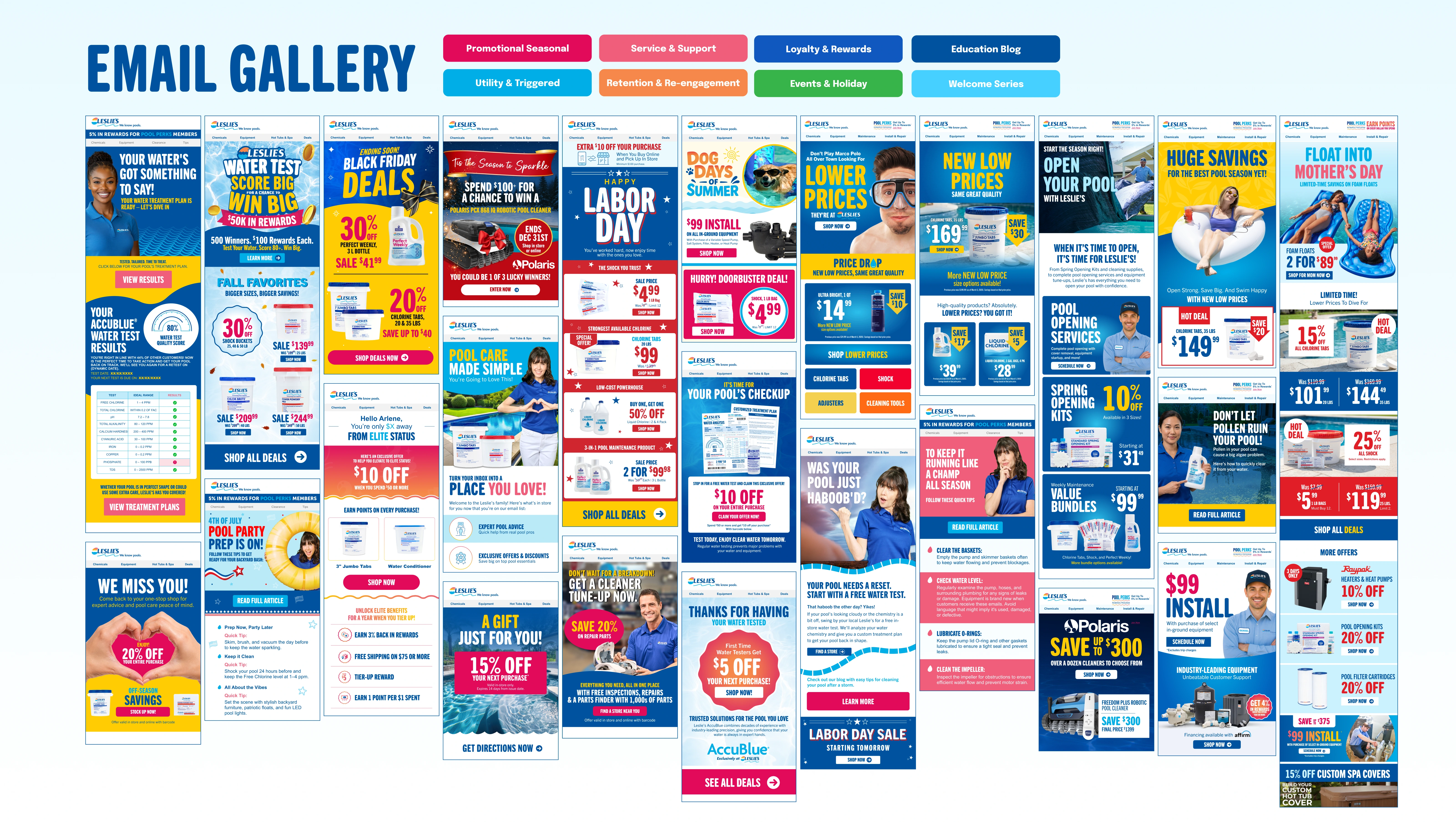
A reusable foundation with recognizable campaign design.
The delivered work combined a modular email library with finished creative across key lifecycle moments. Shared components supported consistent layouts and repeatable updates; campaign-specific graphics preserved the personality and relevance of each message.
The broader brand and email systems supported more than 1,000 assets across the creative program. That figure describes the combined program, rather than the number of emails shown here.
The outcome board summarizes qualitative benefits in consistency, lifecycle coverage, and production efficiency. The examples demonstrate the system and creative range; they do not establish a separate conversion or revenue lift.
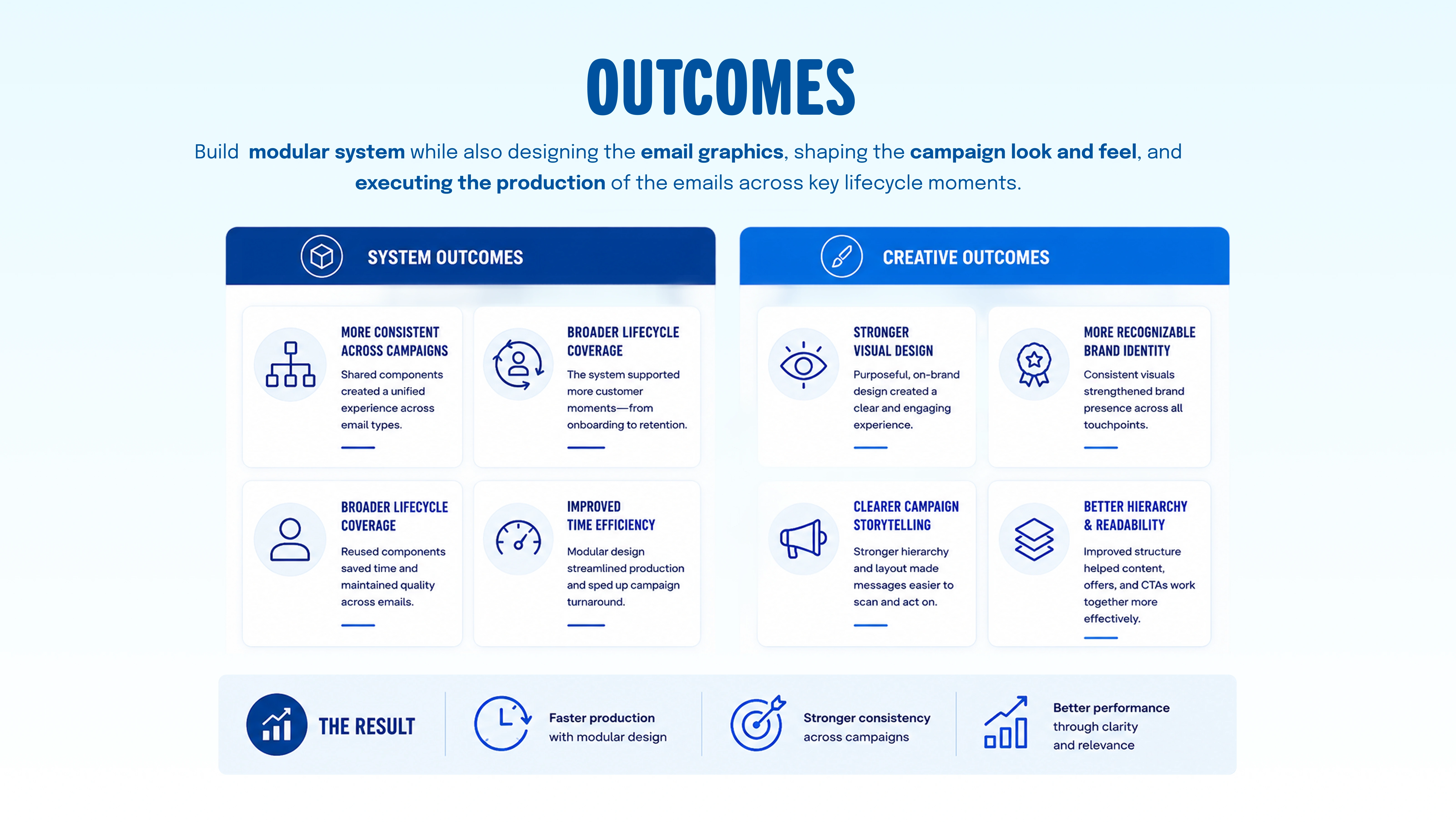
A useful system supports both consistency and creative judgment.
Reusable components handle recurring needs. The designer still decides what matters most in each message—and how imagery, hierarchy, and supporting detail help customers understand the next step.
